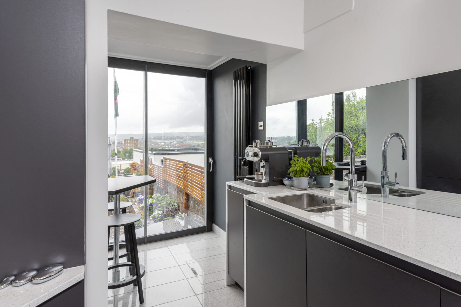
A monochromatic room design may sound like it will be a breeze to execute, but to do it well while limiting your scope, can be all the more challenging. When done well, a monochromatic room should take full advantage of tonal takes on a hue with a variety of related tints and shades for a rich and brilliant effect, while adding textures for visual interest. When done wrong, a monochrome room design will come off as tired, uninspiring and stuck with a lack of interest and stimulation.
A monochrome environment is a space in which most architectural elements are of a single colour. Although it is common for architects to design black or white monochromatic spaces due to its neutrality, it is possible to use almost any colour to design a space, taking advantage of their infinite tones, undertones, and shades. When planning your custom designed kitchen, choosing the right colour composition for an environment can aid in executing the design strategy.
- Highlighting
Designing with a single colour in the kitchen is a useful strategy when looking to highlight the entire space or any of its elements in particular. Through this means, it is possible to contrast the colour with household appliances, accentuate special coatings, or emphasise objects, utensils, and accessories. Be it art, statement furniture or just the room itself, a monochromatic colour scheme is certain to draw attention to the parts of a room you want to be noticed. Monochrome colour schemes are harmonious and relaxing too, and they’ll work perfectly in any part of your home where relaxation is key. And they can still have a dramatic effect without having to contrast colours and are an excellent way of repeating colours without having to think about it too much.
- Unifying
Opting for a monochrome palette can be an effective strategy for unifying the elements that make up an environment, making it a widely used option when looking to design a bolder kitchen atmosphere. In these cases, it is common for designers to take advantage of the infinite shades, undertones, and variations of each chosen colour. When considering monochromatic colour schemes we suggest that you use three colours. Select your colour and choose a range of three shades – one dark, one in the middle, and one light. This will help you create a cohesive look. A smart practice of choosing hues is to select your base shade from a paint chart, and then use that paint chart to choose different colours which have the same base, from light to dark.
- Zoning
Some schemes organise their spaces by separating them, using colour to achieve this goal, enhancing this zoning through mobile partitions that open or close depending on the use of the kitchen. When you are filling your room with similar colours you can run the risk of the room merging into one, without much definition. Use colour to create focal points around a room and highlight focal points as well. They don’t have to be exuberant bright colours, but choosing something with a slightly different tone, which stands out against your monochrome pallet will make a huge difference. Go for calmer and softer colours for larger spaces, such as walls and furniture, and use bolder colours for smaller accents such as accessories, art, and rugs. Placing bold accents in front of soft zones of colour draws attention to accents in a monochromatic room. Placing lighter tones on walls will also make your room feel larger and more spacious while keeping it cozy and comfortable with accessories.
If you need advice designing your kitchen, don’t hesitate to get in touch with us. We’d love to help.
Have a great weekend
Clinton and Fiona
